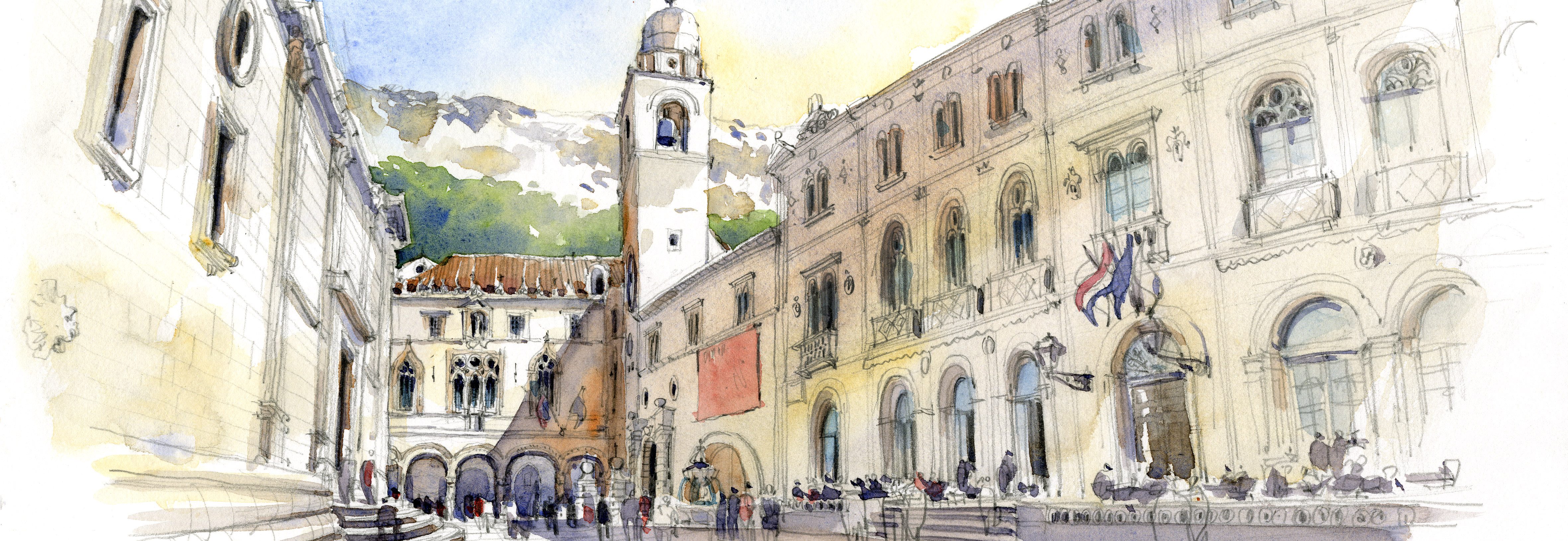

As primarily a travel sketcher who is now stuck at home on Day 47, I’m finally turning my sights to drawing our house. What started as a simple sketch of our small living room turned into creating a way to identify beloved objects, a road may for our kids who some day may want to know what all this stuff is and where it came from. (I’ve instructed them not to sell the watercolor paintings and my brushes at a yard sale!)
And since I was sketching at home, I had the luxury of being able to stop and start, and to scan various phases of the sketch. I LOVED the line drawing and hesitated to add any color at all, but then took the plunge and added a little underpainting to establish the voids or recessed spaces. Finally, more color, although I tried to restrain myself and leave a lot of white to give a sense of the sunlight.
In the end, my favorite is the underpainted version, and the kind folks who responded to my Instagram post helped me figure out why (most liked the full color version, by the way.) I like the unfinished quality of the sketch at that point, the areas that are left white feel fresh. It’s a painting of potential, one that doesn’t overpower the line drawing I really liked and didn’t want to lose with too much paint (which happens all too often!)
How about you, which version do you like best?


And the steps:
1–Initial rough sketch blocking out the big shapes. You can see my vanishing point right in front of me, and my eye level line drawn all the way across the page. I didn’t erase any of these lines, other than moving the Eames chair, I drew right over them.
2– Completed line drawing. I love being able to se all the little details! I added the text.
3– Underpainting, it’s my way of easing into the painting by dipping my toe in first. Cool colors show the recesses, the warm colors advance.
4–Full color, but a muted palette so I don’t cover up too much of the lines I love. I tried to restrain from painting too much, by leaving areas of the paper white to show sunlight.
This post also appears on the Urban Sketchers blog at http://www.urbansketchers.org.

My initial reactions was to chose #3 but I didn’t like how the purple intruded, it seemed to draw attention to itself. So I finally went with the final image when all the colors, including the white of the paper, were balanced and how the darks and the lights created a tone and mood. Very fine. Nice going!
Frank B
LikeLiked by 1 person
Thank you, Frank!!! You are in good company, most who commented on Instagram preferred the final color version too!
S
LikeLike