Thinking about an in-person or online workshop next year? Maybe a bit of travel? Contact me or follow the links for information and registration. And check the workshop tabs at Drawing Perspectives for updates. Thank you!

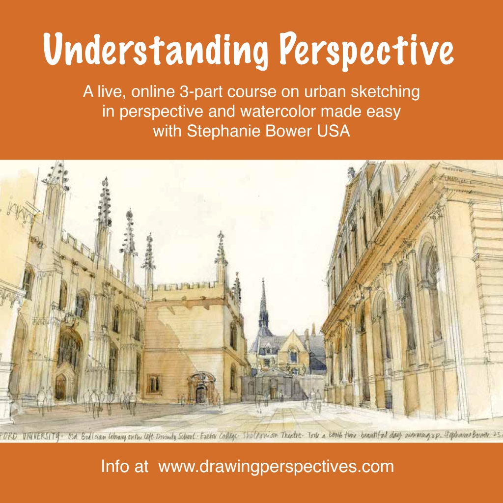
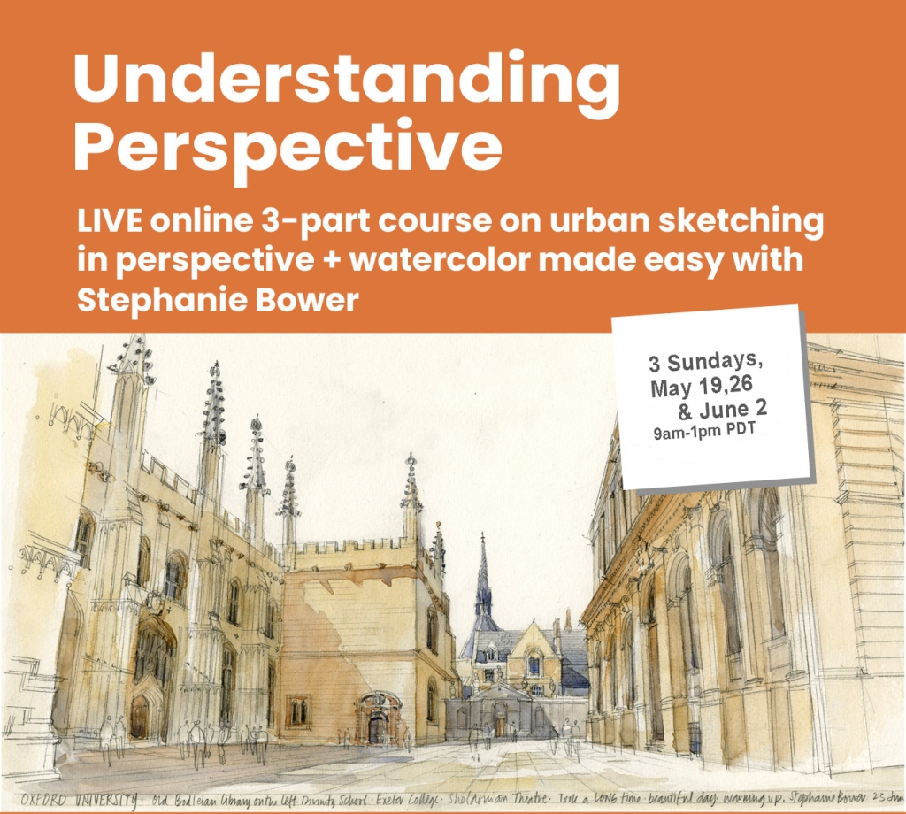
LIVE ONLINE on Zoom: Understanding Perspective + Lots More! | Three, 4-hour classes that finally demystify perspective and watercolor sketching. These classes are packed with information, you’ll learn tons. More classes will be added in the Spring.
January 5, 12, 19, 2025 at 9am PST | Only 2 spots left! Email me for info at stephaniebower.workshops@gmail.com
____________________

LIVE ONLINE: Terracotta Explorer: Perspective in Spain, Towers are Like Wedding Cakes | This is part of an ongoing series of classes through Terracotta, whose cadre of artists are among the best in the world. A few can join specifically for my one class on sketching towers.
January 9, 2025 | Info is HERE.
____________________

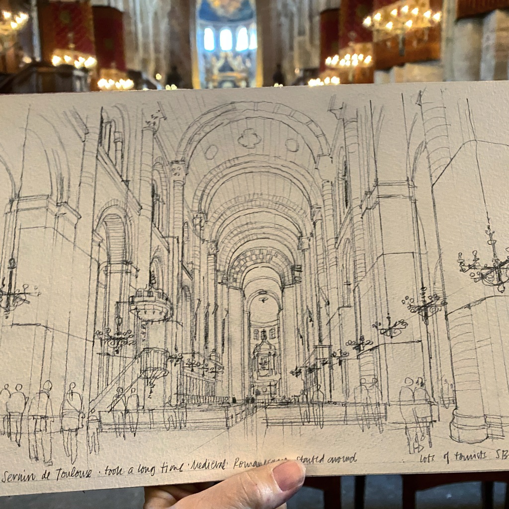
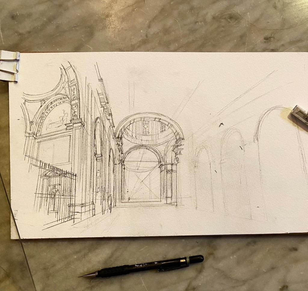
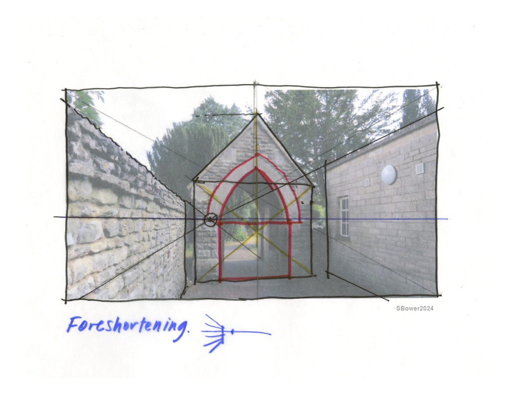
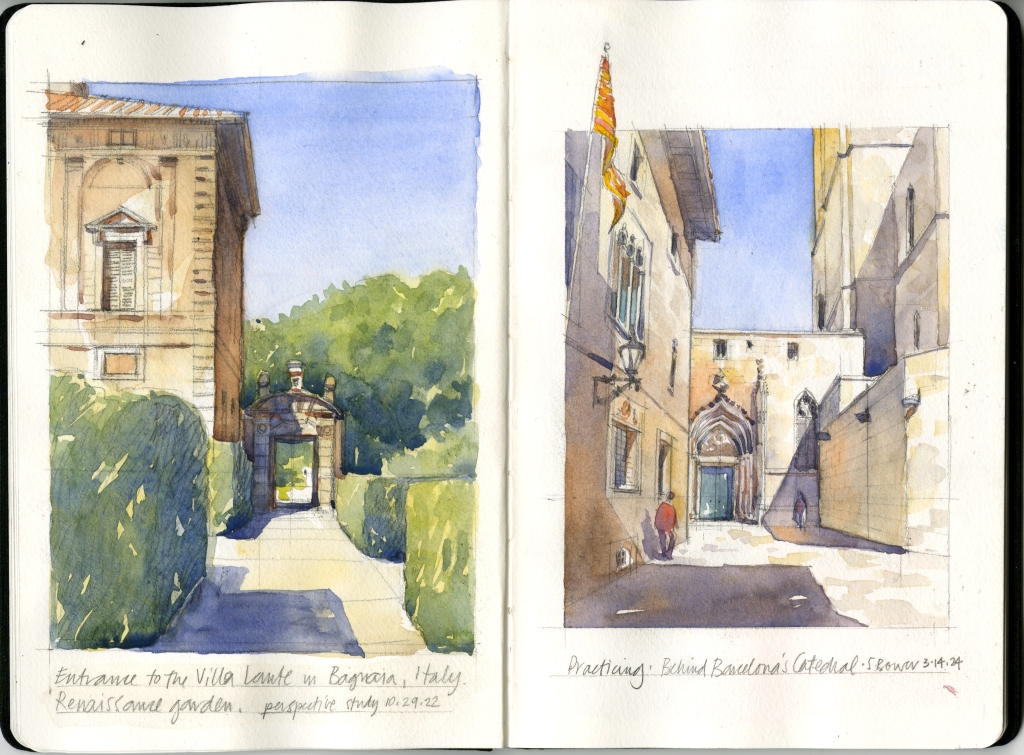
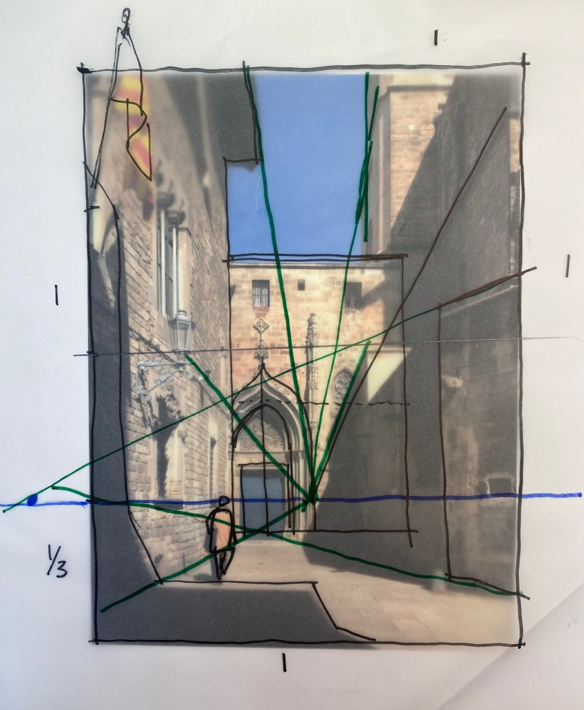
LIVE ONLINE: Terracotta Symposium: The Foundations of Architectural Art | This event is not to be missed! Join four instructors who specialize in sketching and painting architecture–the rockstar Thomas Schaller, Alex Hillkurtz, Pablo Questa, and me (Stephanie Bower! ) — and immerse yourself for a weekend in the world of architectural beauty as each artist leads an in-depth session with live demonstrations and an interactive Q&A. Lifetime access to recordings. My workshop will be on sketching this view of Turl Street in Oxford.
February 8-9, 2025 | Info is HERE.
Use code BOWER50 to get a whopping $50 off the early bird price!
____________________

LIVE IN-PERSON | Urban Sketching in Quebec City, Canada | You’ll think you are in old world Europe, but it’s Canada! Join me and Studio 56 for 6 nights, 5 days of instruction as you learn how to sketch streets, fountains, elegant towers, and more…lessons in the morning, cultural visits and sketching in the afternoons. Register now for early bird pricing.
July 30-August 5, 2025. Info is HERE.
____________________

LIVE IN-PERSON: Northern California Coast at Pacific Grove | Imagine 5 days of sketching this beautiful coast, old churches and missions, and more for a combination of in studio and outdoor urban sketching. Sponsored by MISA in their beautiful new workshop location.
October 19-24, 2025. Info is HERE.
________________
Already full, Join the waiting list:
Oxford | June 9-14, 2025
Civita di Bagnoregio, Italy | September 19-25, 2025
Still being planned:
Understanding Perspective, more live online workshops
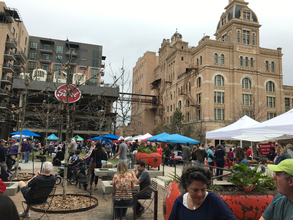
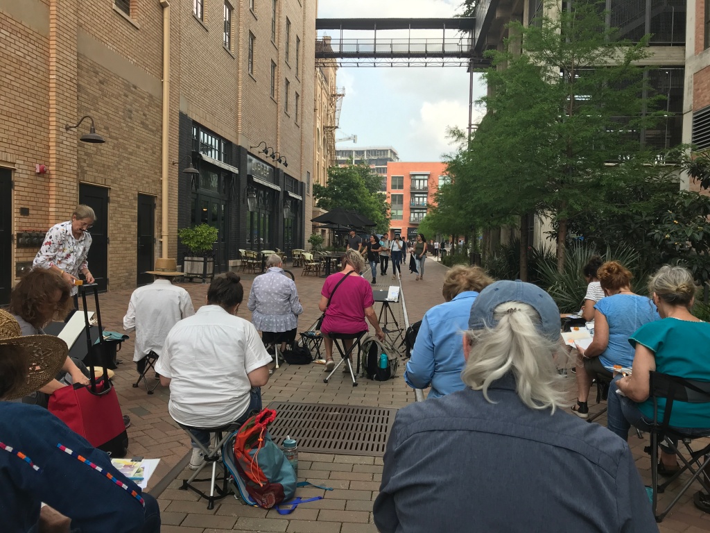
San Antonio, Texas | Spring 2025
Oxford UK | Sunday, June 15 | Half-day workshop for local sketchers
Chicago Sketch Seminar | July 11-13, 2025
Thanks so much for your interest in these workshops! For info or questions, email stephaniebower.workshops@gmail.com