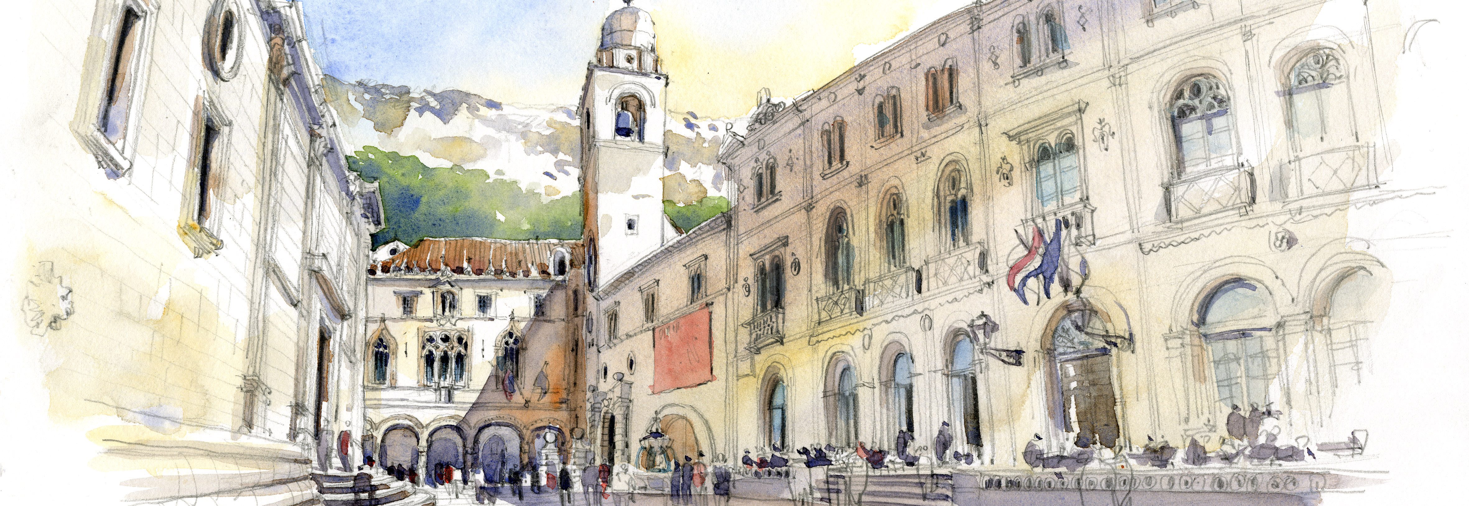
I’ve been working hard on a BIG day job deadline (more on that in future), so no sketching of late. Instead, I thought I’d share my studio set up with you since it’s sitting on my desk a lot. What a mess! It’s basically a larger version of what I take on the road.
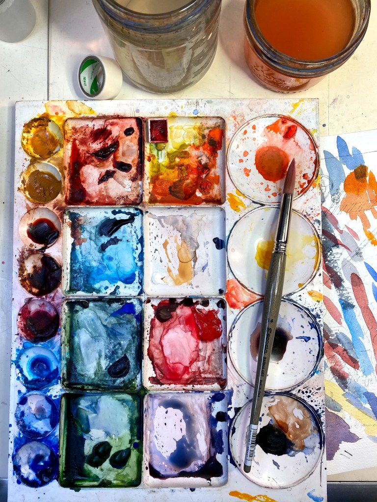
This is a very classic color palette. There aren’t a lot of bright or newly concocted colors. My palette tends to reflect the natural material colors found in architecture. Here are the paints I use, in order starting top left to bottom:
YELLOWS
New Gamboge– warm yellow for sunlight on trees and grass.
Yellow Ochre — I use this color a lot. I drop it in to grays for sunlight on concrete, I also started underpainting with it. Underpainting establishes lights and darks as well as unifies the entire painting. This can get a little thick when mixing, so I’m careful not to combine it with other thick paints.
Elsewhere on palette is Aureolin, a transparent cool yellow I use for underpainting, the first layers I put on my paper. I always underpaint in my illustration work in the studio, only do it sometimes when sketching.
REDS
Quinacridone Burnt Orange, Daniel Smith — This color looks almost identical to Burnt Sienna, but it behaves very differently when mixed or on paper. In general, I don’t mix with this color, but it is essential in my palette to drop into wet paint for glow in shade and shadow. It retains its brightness in the wet paint, where as BS blends in and turns gray.
Burnt Sienna, Winsor & Newton — I like the WN version of this paint. A natural brick red color, it’s essential for my palette. I use this for lots of things, but particularly for mixing with French Ultramarine to make grays. And I paint with a lot of grays!!!
Permanent Alizarin Crimson — A very little goes a long way with this color! I never have to bring an extra tube on the road, the blob in my palette lasts forever. This color is key to mixing purples, and I use it to make my magic gray, a combination of French Ultramarine+Burnt Sienna, with 2 molecules of PAC dropped in. I use this mixed color for shade and shadow, it’s indispensable.
Elsewhere on my palette, Quinacridone Burnt Scarlet (Daniel Smith). I use this color to brighten brick or red colors. I also have a blob of red, I’m not sure which one it is, as I rarely use a true red! Might be Pyrrole Red.
BLUES
Manganese blue — I use this for bright, summer skies. In fact, I usually have three blues in skies. I start with Manganese for the lighter part of the sky and also along the horizon, then go to Cobalt blue, then finish with French Ultramarine. The trick is to blend these, so I sometimes pre-wet the paper.
Cobalt Blue — I use this blue in places that I want to recede in space, as it’s a cooler blue. Perfect for those hazy mountains in the background. I also use it with a molecule PAC to make a pale blue-purple hue.
French Ultramarine — On a tour of the Daniel Smith paint production facilities, I think I remember learning that the particle size in this paint makes it appear brighter. I prefer it to the regular Ultramarine blue, although they are soooooo close in hue. I typically use the WN version of this paint, as the DS version separates out and granulates in a way that I don’t like, although lots of sketchers love this effect and intentionally use the DS version.
Also on the palette is Sap Green, a color I use as a base for my greens. It’s very bright, so the first thing I do is knock it back with its compliment, lots of Burnt Sienna. I brighten it with yellows, I deepen it with French Ultramarine.
I also have DS Perylene Green on the palette. I like this color but am still figuring out how to use it.
Last essential color is DS Pyrrole Orange. Anyone who has taken my two online courses on Craftsy, now Bluprint (Craftsy was bought out by NBC/Universal!!!), has seen me finish up a sketch by dropping 3 spots of PO near the eye level line and VP to brighten up the painting and add a sense of activity. It works like magic. I love this color!!!
Two pots of water, one I use for dirty brushes on the right, the other I try to keep clean for when I need clean water.
You’ll also see Nichiban architectural masking tape. A Japanese tape that used to be difficult to find, but it’s now inexpensive and available on Amazon. It’s THE BEST.
So there you are. Next up, my favorite BRUSHES.

Wow! Love this, Stephanie! Not just which colors you choose – as many do – but WHY! Brilliant and very helpful.
LikeLike
Thank you, Bill! So glad you find this helpful!!
S
LikeLike
Thank you Stephanie! I, too, am finding your watercolor notes extremely helpful. I can manage a fairly dark grey with the french ultramarine and burnt sienna. Any secret to getting a light grey. If I just add more water it just looks washed out. Thoughts? Thanks in advance!
LikeLike
Thanks, Dory…for a light gray, change the Ultramarine to a Cobalt blue. You literally CAN’T make a dark gray with that blue, no matter how hard you try!!
LikeLike
I’m wondering if you can leave a link for the Nichiban architectural masking tape. I looked for it on Amazon and there were so many to choose from. Thanks for your list of colors. It is always a quandary when wanting to try a new color, which one to try.
LikeLike
Kate, here it is. It is the architectural masking tape, I think they sell it in two widths. It is great, I use it all the time.
LikeLike
Greetings Stephanie. As always, I look forward to and enjoy each and every one of your posts. I am wondering if you will share what is a “molecule PAC” is…that you referred to when you wrote about Cobalt Blue.
Thanks….Cindy
LikeLike
Hi Cindy, thank you so much for the kind comments! Molecule of PAC is a teeny amount of Permanent Alizarin Crimson!! It works magic in that gray mix, makes all the difference in the world. But use VERY little!
S
LikeLike
Thanks for a great post, it’s good to hear which pigments you are using and especially why. I will have to try my yellow ochre more often. Can I ask if you have a preference of brand for Manganese blue?
LikeLike
Thanks, Iona…I don’t have a preference for brand of Manganese blue…it’s a useful color, I also drop it into green trees!
S
LikeLike
Thank you for this post. I am often wondering if I should try different colors in my limited palette. Now I have a reason to make some changes. I love that you explained how you use each color.
LikeLike