Looking at sketches on Instagram or Facebook, it’s often hard to see the details in my sketches. I love to work in large, horizontal wide-angle compositions, but they tend to not read particularly well in online formats–if I post the entire sketch, the details get lost. In order to see some of that architectural detail I love, the past few days I’ve posted a few cropped, zoomed-in images of sketches from this summer in Spain, Italy, and Croatia on both IG and FB.

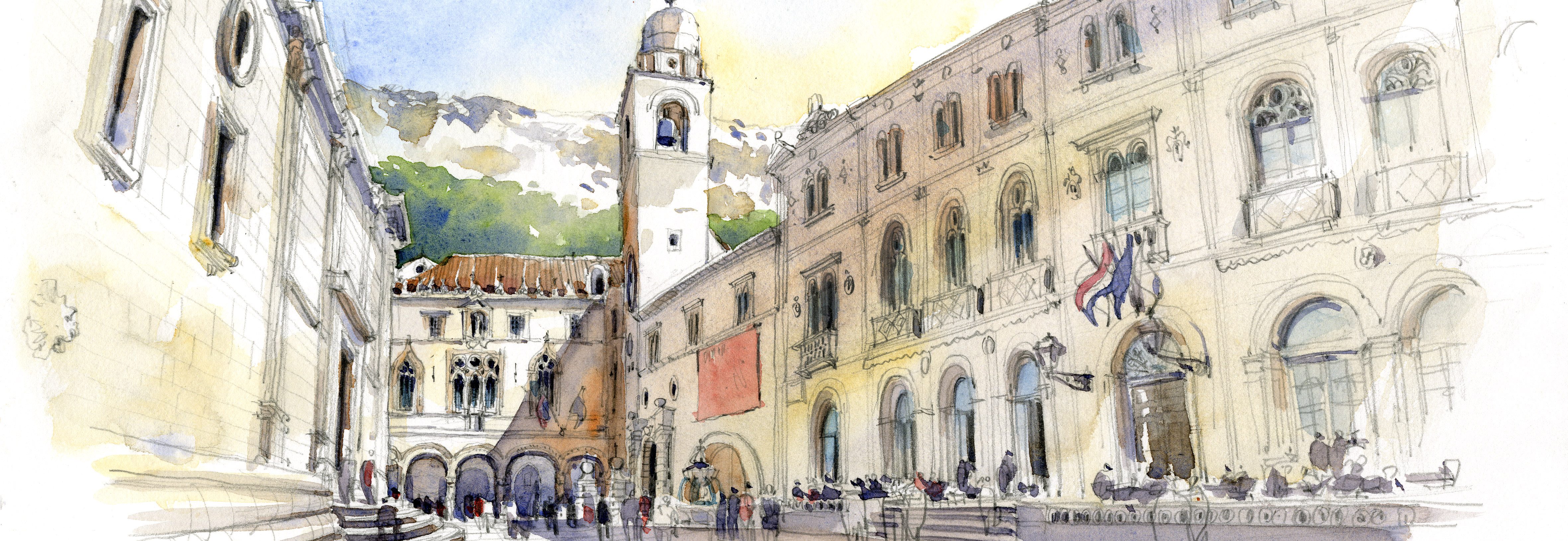
A number of people have posted comments about how they like the “glow” in the shade and shadows, so I thought I’d write a blog post to talk about how I get that effect. To create an incredible glow, I rely on the magic of Daniel Smith’s Quinacridone Burnt Orange! You can see it in the warm orange color to the left of the tower in the image from Dubrovnik.
First, let’s talk about the differences between SHADE and SHADOW. Shade is the backside of a lit form, while SHADOW is the darkness that is cast onto other surfaces by forms. Shade tends to appear warmer and lighter when compared to shadow, which appears cooler and darker.
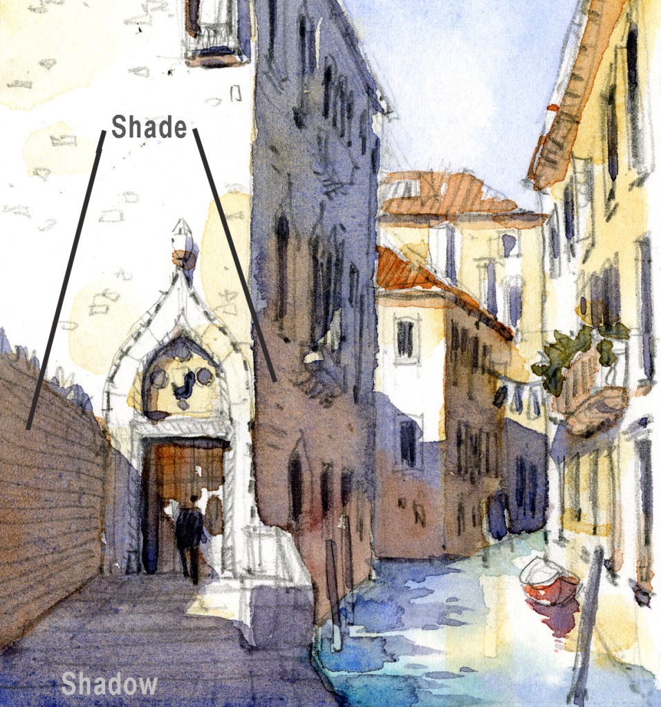
I start by painting the upper/outer, darker part of the shade or shadow using a blueish gray made from three colors: Winsor & Newton French Ultramarine + W&N Burnt Sienna added to make a Payne’s gray, then finally I add a touch–just a few molecules– of Permanent Alizarin Crimson to add depth and warmth. That tiny bit of PAC makes a huge difference! I will vary the percentages to get the color on the gray side or more on the blue or purple side.
So first I paint the gray, then while it’s wet, I drop in the QBO in areas where I want a sense of bounced light, often toward the bottom of a wall or the ground near a wall. QBO displaces the gray and leaves a warm, orangey glow. Some people ask why not just use the Burnt Sienna as they are almost identical in hue. The reason? They behave very differently on paper or when mixed. The wet-on-wet QBO somehow retains its bright orangey color, while the BS goes to a gray, and it’s that orange that creates the glow.
Take a look at these cropped sketches. You’ll also see lots of Quinacridone Burnt Orange dropped into lots of places for that magical glow!


I have been wondering why you have both DS burnt orange and WN burnt sienna in your palette because they do look at first glance very similar. Now I know! Thank you for this explanation, Stephanie. It is extremely helpful!
LikeLike
That was quick!! Thanks so much, Dory, I’m so glad it was helpful!
LikeLike
Really helpful – I’m buying some this week! Thank you.
LikeLike
Thanks for your comment, I hope you will like using this amazing color!!
LikeLike
love it thanks Stephanie.. so well written!!!
LikeLike
Thanks Stephanie, for answering my question without my asking it! I too use DS QBO frequently, and in similar fashion, but was wondering whether you were dropping it into straight Ultramarine or another color or mix – so now I know! Interesting that you’re not using the Burnt Orange rather than Burnt Sienna to mix your gray, although I know they are not quite the same, why is that? Love your work, thanks for sharing!
LikeLike
Hi Chris,
Happy New Year, and thanks for your note! That QBO works like magic, doesn’t it? I don’t use it for mixing grays because I don’t like the color it produces when mixed with the Ultramarine. Using BS makes for a classic gray used for centuries, basically a Payne’s Gray–it mixes so well with all the other colors in my palette too…
Thanks again!
S
LikeLike