Studio or On Location? Which is better?

I’m pretty bad about keeping up a daily practice of just about anything…diet, exercise, sketching, blogs–you get the idea. But during these dark days of a Seattle winter, I realized that my sketching skills were getting a bit rusty. To keep the gears oiled, I decided to work from photos in a sketchbook in my studio. It’s been good practice, and I’ve been posting the sketches on IG and FB, but in so doing, I noticed that there is a big difference between the studio sketches and the ones I do on location. Here is a perfect example.

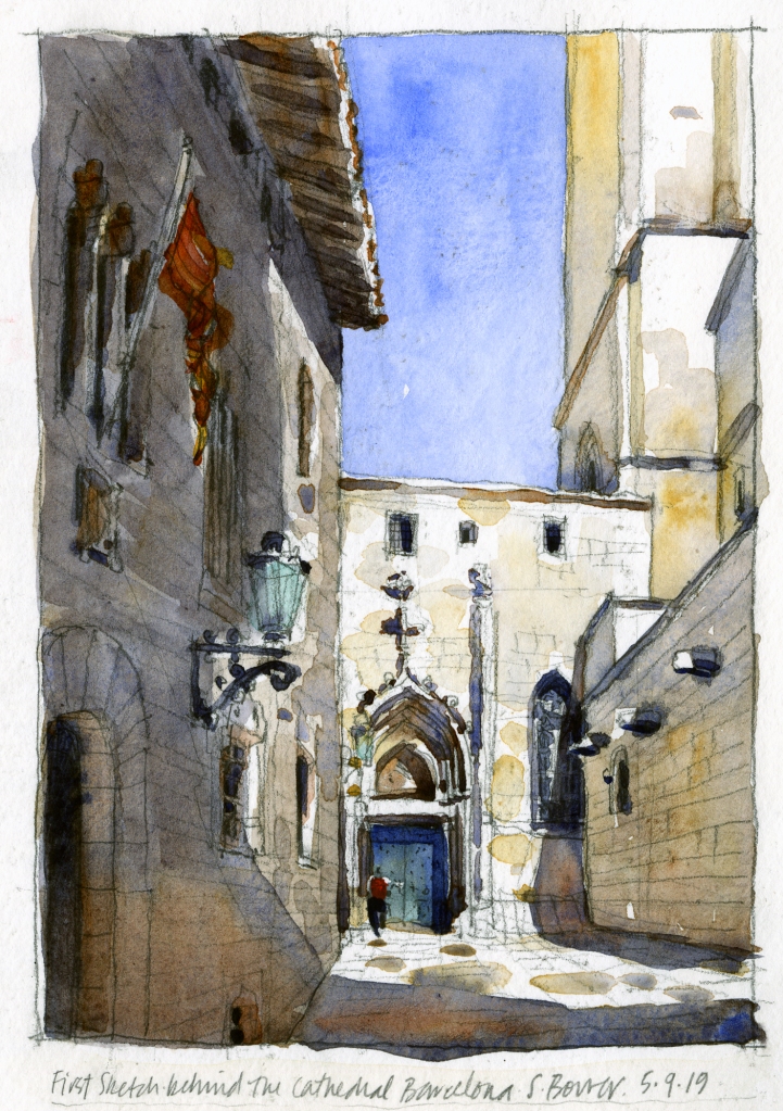
The sketch above was done on location one sunny morning sitting in a corner on the backside of the Catedral in Barcelona in 2019. Yes, I can feel the heat, remember the sounds of the people walking by…all those details that are magically infused into a live, on location sketch.

The sketch below on the right is the same scene, done a few days ago in my studio in Seattle from a photo that I took. A big difference that I didn’t realize until well after it was done. Why so different?

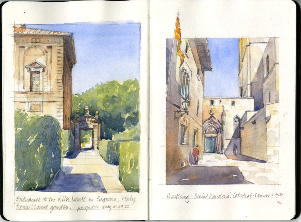
In many ways, working in the comfort of a warm and dry studio is easier than battling the elements, the truck that blocks your view and all the things we urban sketchers deal with when working out in the world. I think that’s why my studio image, while I like it a lot, is calmer, has more subtle watercolor washes, etc. But it also lacks the energy, contrast, and I don’t know what else that the on-site sketch has–that energy infused into a sketch is a bit part of why I love being an urban sketcher. It’s less about making pretty art and more about capturing the experience. But studio work is great to do too, and pretty art is wonderful…and it’s certainly good practice for me. We are always working on improving what we do, right?

And if you are curious, that is an Escoda sketchbook (approx. 5″ x 8″) that was given to me and small group when we visited the Escoda factory a few years ago. The paper buckles a bit under the wet washes, but it does take the color and pencil work nicely. I hope to fill this book with small studio sketches!

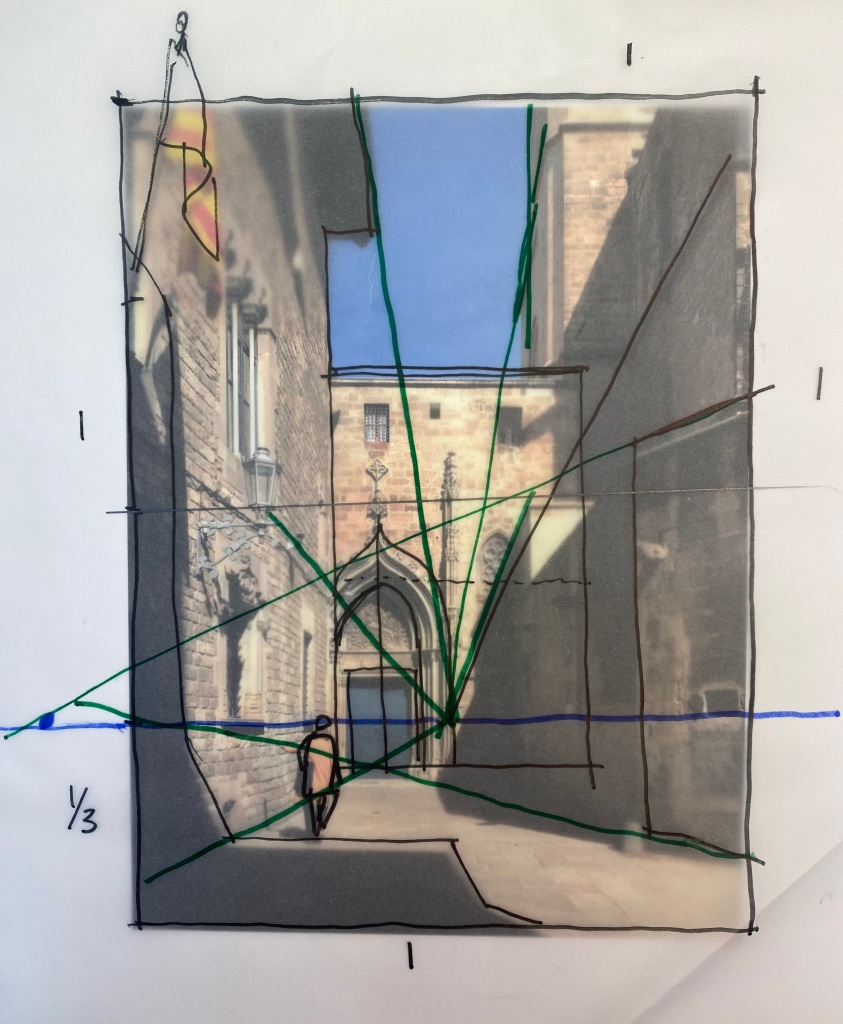
Anyone who has ever done one of my workshops knows that I love teaching how to analyze the proportions and perspective in any view I sketch (does anyone else do this?), so I had to include the analysis for this one. 🙂

The Magic of Daniel Smith Quinacridone Burnt Orange

Looking at sketches on Instagram or Facebook, it’s often hard to see the details in my sketches. I love to work in large, horizontal wide-angle compositions, but they tend to not read particularly well in online formats–if I post the entire sketch, the details get lost. In order to see some of that architectural detail I love, the past few days I’ve posted a few cropped, zoomed-in images of sketches from this summer in Spain, Italy, and Croatia on both IG and FB.

A number of people have posted comments about how they like the “glow” in the shade and shadows, so I thought I’d write a blog post to talk about how I get that effect. To create an incredible glow, I rely on the magic of Daniel Smith’s Quinacridone Burnt Orange! You can see it in the warm orange color to the left of the tower in the image from Dubrovnik.

First, let’s talk about the differences between SHADE and SHADOW. Shade is the backside of a lit form, while SHADOW is the darkness that is cast onto other surfaces by forms. Shade tends to appear warmer and lighter when compared to shadow, which appears cooler and darker.

I start by painting the upper/outer, darker part of the shade or shadow using a blueish gray made from three colors: Winsor & Newton French Ultramarine + W&N Burnt Sienna added to make a Payne’s gray, then finally I add a touch–just a few molecules– of Permanent Alizarin Crimson to add depth and warmth. That tiny bit of PAC makes a huge difference! I will vary the percentages to get the color on the gray side or more on the blue or purple side.

So first I paint the gray, then while it’s wet, I drop in the QBO in areas where I want a sense of bounced light, often toward the bottom of a wall or the ground near a wall. QBO displaces the gray and leaves a warm, orangey glow. Some people ask why not just use the Burnt Sienna as they are almost identical in hue. The reason? They behave very differently on paper or when mixed. The wet-on-wet QBO somehow retains its bright orangey color, while the BS goes to a gray, and it’s that orange that creates the glow.

Take a look at these cropped sketches. You’ll also see lots of Quinacridone Burnt Orange dropped into lots of places for that magical glow!