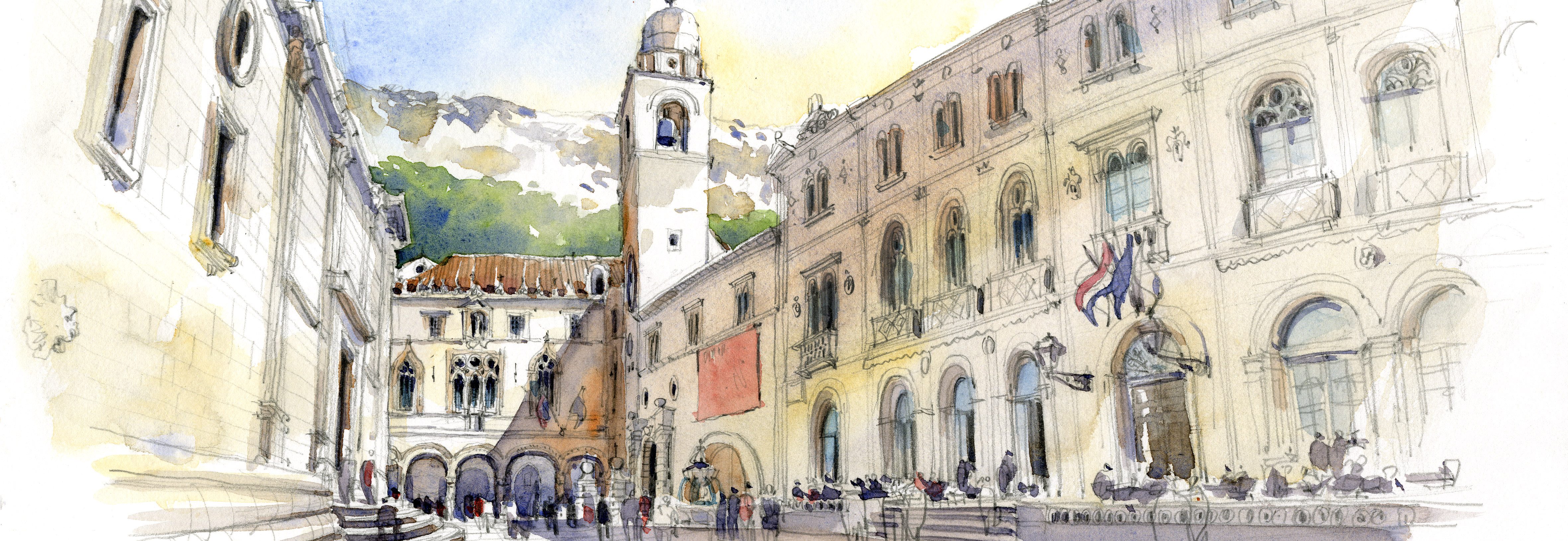
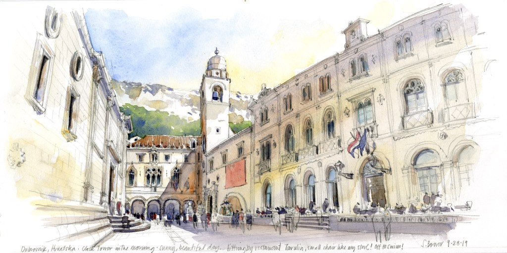
Thank you so much for signing up to follow this new blog! I thought for starters, I’ll talk about the sketch on the header…it’s sort of like starting your meal with dessert, as it was one of the last sketches of my 3 (!!) separate teaching trips to Europe this summer! This is a view from Dubrovnik, Croatia, looking toward the belltower and entry into the old city. Yes, this city was Westeros in Game of Thrones.
This trip started in Venice (more sketches to follow in more posts) and ended by traveling with my husband in Croatia. I love teaching, but as every instructor knows, it’s impossible to find the time and focus to do your own thing before or during a workshop…our job is to focus on our students, of course! So as I book my trips of late, I’m trying to factor in some time to do my own work.
It always takes me a long time to warm up, that is to get the feel for where I’m sketching. There are so many variables to consider…the temperature and humidity, the paper, what colors to use, paint, etc. I like to do sketches that look the place I’m sketching, so that the style doesn’t overpower the content. Changing any one of these variables changes everything! Have you experienced that? Warming up also means hitting that sweet spot that is the perfect balance of line and color. I seem to often do a line drawing I love, then paint it so that the linework completely disappears — argh!
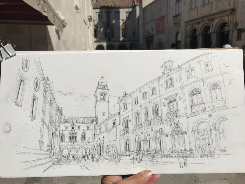
I’m also starting to realize that I like working BIG. I always tell beginning sketchers to start small, that your work will naturally get bigger when it feels right. So in Venice and Croatia, most of the sketches I did for myself were on large, 8″x 16″ (double-square) pieces of Winsor & Newton 140lb. CP watercolor paper, a paper I had really never used before. It was a bit of a risk and it certainly takes longer than filling a small piece of paper, but I started liking the results as I figured out how to work with it. It’s soft enough that it takes layers of paint well (harder papers sort of repel the paint a big, and lift off the color as you attempt to add layers), but it’s also hard enough that I could draw decent pencil lines with my trusty mechanical pencil and 2B lead. The results were soft sketches with color that didn’t overpower the linework. I rather liked painting the non-colors of the creamy white buildings and shiny ground in Dubrovnik. Had to decide if I would push colors to a warm yellow ochre, or a gray, or a blue purple…or a combination of them all.
These sketches took some time. For this one, I sat near a cafe, and the waiters kept coming out to see what I was doing and nod their approval or make suggestions (yes, one did that! He thought it looked like winter with snow on the mountain.) Then there was the issue of the masses of tourists blocking the view. Had to work around that too. As I worked, I went into a trance as I found my pace, my flow…time stopped, and I was just hyperfocused on what I was doing…I love that feeling, it’s rather like a meditation.
I’m super happy with this result…I hope I can capture this feeling on my next trip, and I hope it doesn’t take all summer to find it! Anyone interested in a workshop in Dubrovnik next fall? I’d go again in a heartbeat…

[Detail view…that’s Daniel Smith Quinacridone Burnt Orange dropped into that shadow when the paint was wet…it works GREAT to get the glow! I don’t leave home without it!]

This looks so different. I think it is the color…it just pops. I really like it. I have a number of Winsor and Newton watercolor sketchbooks. I agree the paper is so nice to work on. I also love your new website/blog. Interesting to hear your thoughts on painting in different locations. Thank you for sharing.
LikeLiked by 1 person
Thank you so much for your comment, and so interesting to know you like the paper too! I wish I could find hard bound sketchbooks of it!
S
LikeLiked by 1 person
I live in Australia. The hardbound 100% watercolour sketchbook is available here. I have purchased some through Eckersleys an Art & Craft store listed as https://www.eckersleys.com.au/winsor-newton-hard-bound-water-colour-visual-journals. They do not open flat like a Stillman & Birn sketchbook.
LikeLike
Great sketch! I’d sign up for a Dubrovnik workshop. How long did it take to do the sketch?
Bill Fagan Urban sketchers Chicago.
LikeLike
Congratulations on your new blog, looking forward to hearing about your summer workshops.
I have not used Winsor & Newton watercolor paper yet, and have used Arches since 1984, and am very much liking Sanders Waterford watercolor blocks the best now.
I also like the Daniel Smith Quinacridone Burnt Orange as well, I started using that after a watercolor demo Iain Stewart did a few years ago.
What a gorgeous watercolor, just love it.
LikeLike
Hi Terry, thanks for your comment and good wishes! I cannot sketch on Arches paper, although I use it all the time for work. It’s too textured to draw on, and it soaks up too much paint for my sketching style. Great for painting, not so for sketching, so I was happily surprised by the W&N paper.
The QBO is essential for getting a good glow, I love that paint. And I love Iain Stewart! His sketch from Florence is the last in the book, tip #100. I love his work, and he is so generous to share it for the book!
S
LikeLike